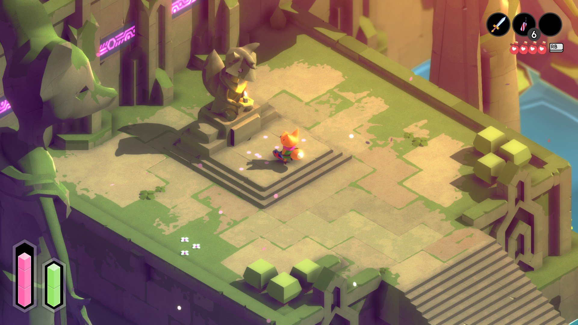
Tunic begins with a beach. With no lengthy preamble or introduction, our protagonist awakens in a strange world crawling with monsters and governed by mysterious magic. He is unarmed until he stumbles upon a stick strong enough to thwart the nearby slimes. From there, he graduates to a sword and sets off on a journey to explore an ever-growing, interconnected world.
Don’t be surprised if this setup sounds familiar. The parallels between the opening moments of Tunic and 1993’s The Legend of Zelda: Link’s Awakening are numerous–and deliberate. Solo developer Andrew Shouldice has made no secret of the inspirations behind his new action/RPG. The DNA of classic Zelda titles can be seen everywhere within Tunic, from the isometric presentation and the way the world opens up as you collect new items. You’ll even assign items to specific buttons from the inventory screen.
The Zelda formula is tried and true at this point, and Tunic no doubt benefits from decades of iteration and homage. But there’s no denying that Shouldice’s execution is a superb take characterized by thoughtful design and a reverence for those that came before. From the moment our hero awakens on that shore, the player is a participant in one of the most emphatic love letters of the last several years.
It’s not just Zelda that Shouldice has channeled with Tunic, however. Another notable influence here is Dark Souls, whose opaque storytelling and environmental storytelling provided a great deal of inspiration.
The combat and death systems also take cues from From Software’s flagship series; upon being felled, you’ll drop a portion of your accumulated currency, but can retrieve it by returning to where you died.
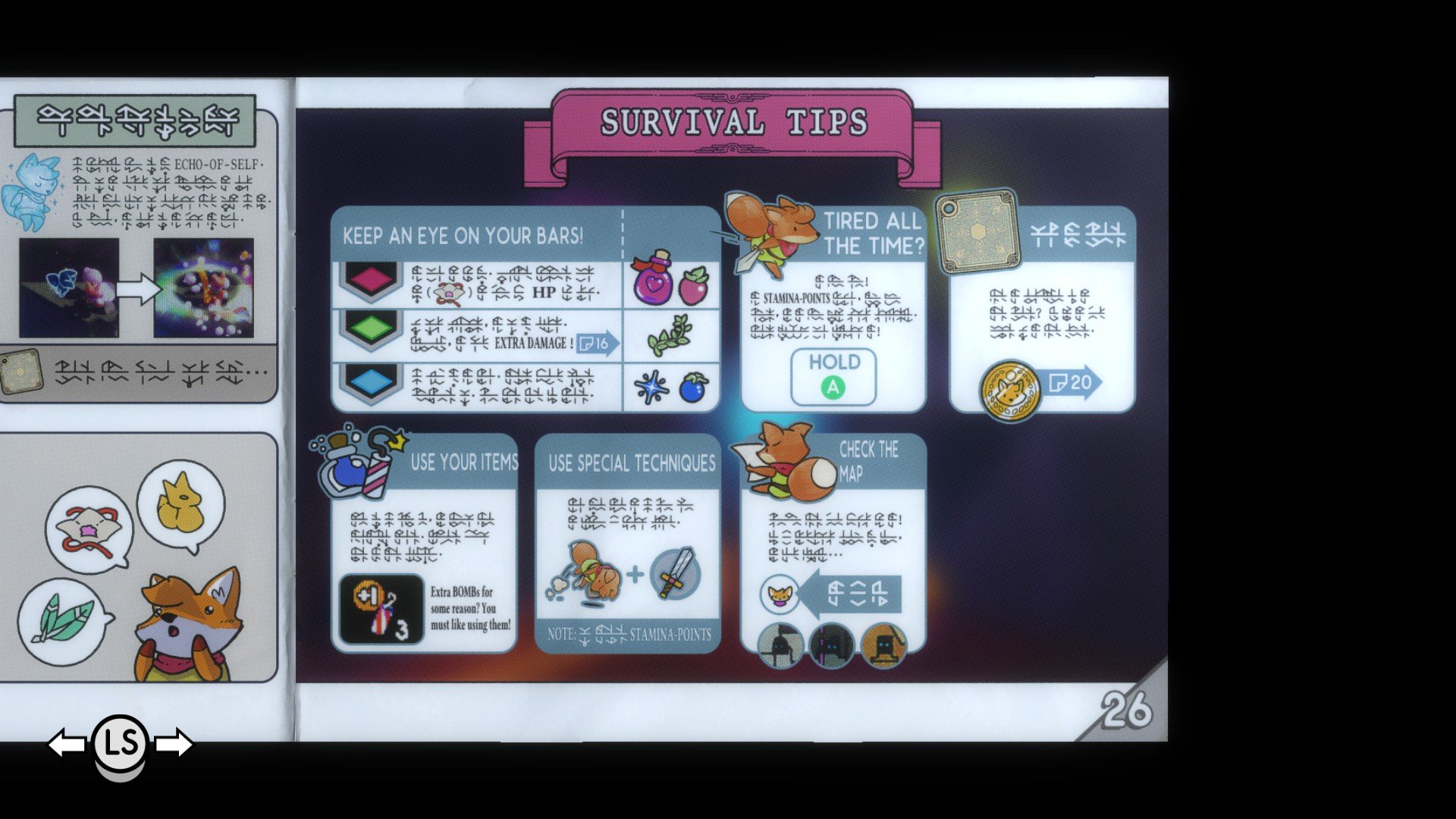
One of the standout features of Tunic is the way you’re guided through its world. At the start, you’re given little in the way of direction. Explore a little bit, however, and you’ll stumble upon a page from an adventuring manual. It’s largely written in an indecipherable language of runes and symbols, but it does offer up some important information. Namely, it gives you a hint on what your immediate goals are.
Much of Tunic’s lore andgameplay information is doled out in this fashion. Gathering the loose page of the instruction manual may provide a nudge toward your next destination, or unveil information about an item you collected. Pages can contain area maps or explainers for gameplay concepts like stamina management. In this way, the manual serves as both a teacher and an element of Tunic’s worldbuilding. The result is a surprisingly immersive experience that makes the player feel like they’re on a journey themselves.

There’s an argument to be made that this method to teaching Tunic might be too vague and opaque for some, but for Shouldice it’s less about approachability and more about paying tribute to a bygone era of video games.
“Those old instruction manuals have a lot of game design in them–especially with games of a certain generation,” Shouldice told GameDaily. “You couldn’t fit a lot of data on a regular cartridge, so if you wanted to include text, the best place to do it was the manual. They put piles of secrets and tips there, almost like they were an extension of the game itself.”
It would have been easy to just tell the player what to do, to include a quest log with a checklist and map icons, but Shouldice said he prefers a world that lets the player explore at their own pace and make genuine discoveries. When asked if he was ever worried about getting players lost at the expense of this design philosophy, Shouldice pointed to a handful of clever tricks he employed to ensure that didn’t happen.
“Subtle camera adjustments can help in some situations, and positioning elements so they enter the player’s field of view at certain times,” he explained. “Drawing the eye away from things is just as important–a secret that we only want a few people to find might have a combat encounter placed near it, so players are distracted by monsters. A bridge or treasure chest might attract your attention, meaning you walk past a hidden path you won’t discover for another hour.”
In playtesting, Shouldice said he was able to get a sense of when players were likely to discover certain mechanics and reinforce that with a manual page delivered at just the right time.
This is something I noticed in my own playthrough. I had found a handful of items–fangs, flowers, statues–whose purpose was a mystery; even hovering over them in the inventory screen only produced question marks. Soon, I collected a manual page that associated these items with character stats like HP, attack power, and defense. I was unable to use these items on their own, though, so it was left to me–the player–to discover their secrets. It turns out that offering the items up at the game’s various checkpoints upgrades your attributes.
Figuring this out was a genuine delight. Tunic revels in this feeling of epiphany, gently encouraging you to check every corner for hidden paths and experiment with different item types. The art style helps in this regard as well. The toy-like environments always seem to hint at some unseen treasure just out of sight. And the hero–an adorable anthropomorphic fox–is rife with cute little quirks. I can’t count how often I’d sprint around just to see his little arms flapping behind him.
There are a lot of gameplay implications in Tunic’s art design, too, which Shouldice said was inspired by his own childhood adventures.
“The isometric perspective helps flatten the world into a feeling like a miniature, or like you’re exploring a map,” he said. “I have fond memories of doing just that, tracing a path along illustrated maps, pretending I was on a little adventure. There are some technical and design constraints that come along with that though. You lose a lot of depth information by using an orthographic projection, and have to make up for it in other ways, for instance. It also affords some neat opportunities as well, like hiding things in plain sight.”
This philosophy extends to the level and world design as well. The explorable area slowly expanded over the course of the 10 or 12 hours I spent with Tunic. There were a couple instances where I thought I was nearing the end only to be confronted with an entirely new dungeon or segment of the overworld. I was never upset, though, as spending time in Tunic’s beautiful world is nothing short of enchanting.
There’s a sort of innocence inspired by the voxel art, a feeling of nostalgia that’s hard to explain. Tunic is a challenging game, yes, but the colorful environments and squared-off bushes evoke something more relaxing. For me personally, interacting with Tunic’s world conjured up childhood afternoons playing with toys, or watching cartoons. Whether or not that was Shouldice’s intent he wouldn’t say, but I came away with a renewed appreciation for the range of emotions games can elicit.

I think the music helped a lot here. Artist Terence Lee–AKA Lifeformed–partnered with vocalist Janice Kwan for Tunic’s soundtrack. The composition is an ethereal, flowing thing that works in tandem with the art to instill a sense of mystery and wonder. Lee said that the pair channeled their nostalgia for old-school games when working on the music. More than that, though, they let the world of Tunic inform their decisions.
“Since Tunic is a game about mystery, we wanted to emphasize that by making the music less about you as a protagonist, and more about the world you are in,” Lee told GameDaily. “By musically highlighting the environment, our hope was that it’d make it feel deeper and full of secrets. This also allowed the music to take on its own pace, giving the player their own time to explore and think, without burning out from the urgency of a more upfront soundtrack.”
Admittedly, nostalgia is a subjective feeling, as is musical taste. That’s the challenge of composing, Lee said. What works for one listener won’t necessarily work for another. As such, writing a piece of music that will evoke the same emotions in everybody is an impossibility. But, for Lee, that’s more of a strength than a weakness.
“It’s not always easy to tell if something sounds ‘nostalgic’ in a universal way or in a personal way, but we are happy with both. If a player feels the nostalgia, then the game connects with them deeply; if the nostalgia is ours alone, then we’ve musically expressed ourselves personally, and the music is stronger for that.”
The music is just one piece in a complete package that is nothing short of brilliant. In a sea of pixel art and chiptunes, Tunic is a refreshingly smooth experience. It’s a palette cleanser in a year that has already seen its share of massive AAA successes, a quiet reprieve in a churning sea of endless Content. Many critics seem to agree, as Tunic is currently sitting at an impressive 85 Metacritic score.
“The reception is more than I ever hoped for,” Shouldice said. “It’s so wonderful to see that the themes of discovery and wonder landed for a lot of folks. But after all’s said and done, I’m glad we managed to finish it. Shipping a game is a very challenging thing to do, and being able to look back on it as a complete product is very satisfying.”
Sam, the Editor-in-Chief of GameDaily.biz, is a former freelance game reporter. He's been seen at IGN, PCGamesN, PCGamer, Unwinnable, and many more. When not writing about games, he is most likely taking care of his two dogs or pretending to know a lot about artisan coffee. Get in touch with Sam by emailing him at sdesatoff@rektglobal.com or follow him on Twitter.
 GameDaily.biz © 2026 | All Rights Reserved.